
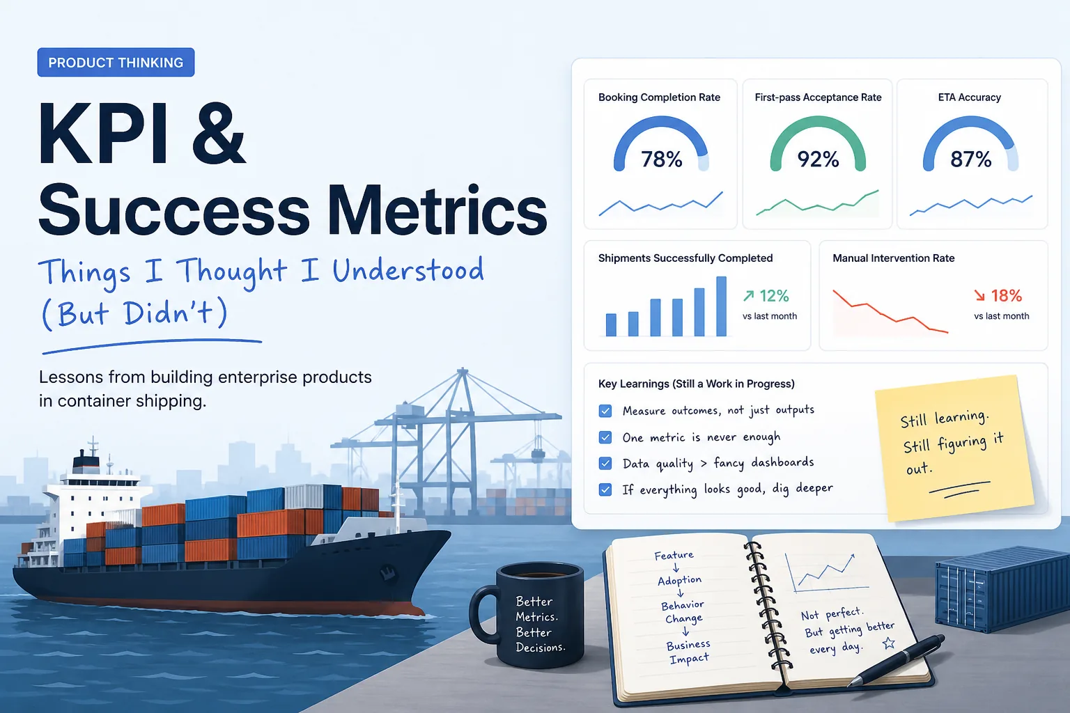
I’ll be honest — when I first got into product, I thought KPI design was pretty straightforward.
Pick a few numbers. Put them on a dashboard. Track them every week. Done.
Page views, booking volume, maybe conversion rate if you want to sound a bit more serious.
It felt like I was doing things right.
But after a few real projects (and a few uncomfortable questions from ops and stakeholders), I started realizing… I didn’t really understand what I was measuring.
Or worse — I didn’t understand why.
This post is not a “perfect guide.” It’s more like me trying to organize my thinking while I’m still learning KPI & success metrics the hard way.
The First Mistake I Made: Measuring What’s Easy
In one of my earlier projects, we tracked things like:
- Number of features shipped
- Number of bookings created
- Page traffic on booking flow
Everything was going up. So naturally, I thought:
“Okay, this is working.”
Then ops team came back with:
“Why are we handling more manual corrections than before?”
That question completely broke my confidence.
Because none of our metrics could answer it.
Looking back, the problem is obvious:
We were measuring activity — not impact.
Output vs Outcome (Took Me Longer Than It Should)
This concept sounds basic now, but it took me a while to actually feel it.
- Output = what we built
- Outcome = what changed because of it
Outputs are easy to see. Features, releases, tickets.
Outcomes are harder. Behavior change, efficiency, fewer mistakes.
One example I personally went through:
- We improved booking UX → output
- Booking completion rate increased → outcome
- But standby bookings also increased → side effect
- Ops workload increased → unintended outcome
So now I try (keyword: try) to think in this chain:
Feature → Adoption → Behavior change → Business impact
But honestly, in real life, this chain is messy and not always clear.
Container Shipping Makes This Even Harder
In most product blogs, metrics look clean and structured.
In container shipping… everything is connected.
Booking
At first, I thought:
“Booking completion rate = good KPI.”
Then I started noticing:
- High completion doesn’t mean clean bookings
- Doesn’t reflect downstream ops effort
- Doesn’t capture bad data or workaround behaviors
So now I try to look at a combination instead:
- Completion rate
- Error rate
- Time-to-book
- Manual intervention rate
Still feels incomplete, but at least less naive than before.
Documentation
This one humbled me fast.
I assumed:
“If documents are submitted, we’re fine.”
Then I learned:
- Submission ≠ usable
- Small errors = real operational cost
Metrics I didn’t even know existed before:
- First-pass acceptance rate
- Document error rate
- Late submission rate
Now it makes sense — because in this domain, mistakes don’t just affect UX. They affect real shipments.
Visibility
This one is tricky in a different way.
You can easily say:
- “We track X shipments”
Sounds impressive.
But then you ask:
- Are milestones actually complete?
- Is ETA accurate?
- Is data synchronized across systems?
A dashboard can look “full” but still be misleading.
That’s something I’m still trying to get better at spotting.
The “North Star” Problem (Still Figuring This Out)
Everyone talks about North Star metrics like it’s obvious.
It wasn’t obvious to me.
At first I thought:
“Just pick something tied to revenue.”
Now I’m experimenting with something like:
Shipments Successfully Completed Per Month
I like it because:
- It combines volume + quality
- Harder to game
- Ops teams actually care
But I’m not fully confident yet.
Feels like one of those things you only understand after getting it wrong a few times.
Something I Completely Underestimated: Instrumentation
This one is painful to admit.
I used to define KPIs in slides without checking if we could actually track them.
Then engineering asks:
“Where does this data come from?”
…and I don’t have a clear answer.
Now I’m learning to ask earlier:
- Is this event tracked?
- Is the data reliable?
- Can we segment it?
Especially in shipping systems, where data comes from:
- Internal systems
- Carrier APIs
- EDI feeds
- Sometimes emails
“Just measure it” is not a real plan.
Dashboards: I Thought One Was Enough
Another wrong assumption.
I thought:
“Let’s build one dashboard for everyone.”
Turns out:
- Ops want real-time and actionable
- Managers want trends
- Executives want summary
Mix everything together… and nobody is happy.
Still figuring out how to balance this without overcomplicating things.
Vanity Metrics (Yeah… I Fell Into This Too)
Some metrics look good but don’t mean much.
I’ve personally been excited about:
- Total shipments tracked
- Platform logins
- Features released
Now I’m more skeptical.
Because:
- More logins might mean worse UX
- More tracked shipments might hide bad data
- More features might just mean more complexity
So now I try to ask:
“What behavior does this metric actually encourage?”
Not always easy to answer.
Where I’m At Right Now
I don’t think I’ve figured out KPI design.
If anything, I just moved from:
“Metrics are simple”
to
“Metrics are easy to get wrong”
What I’m starting to believe:
- Metrics should reflect real workflow outcomes
- One metric is never enough
- Data quality matters more than dashboards
- If everything looks good, something is probably missing
And maybe most importantly:
I should be a bit less confident when defining KPIs.
If you’re also early in this, you’re not alone.
I’m still learning this step by step — mostly by realizing what I misunderstood before.